
In today’s digital world, people access websites using a wide range of devices, including smartphones, tablets, laptops, desktops, and even smart TVs. With such diversity in screen sizes and resolutions, designing a website that works well everywhere is no longer optional. This is where responsive web design becomes essential.
Responsive web design (RWD) is a modern web development approach that ensures a website automatically adapts its layout, content, and functionality to different screen sizes and devices. Instead of creating separate versions of a website for mobile and desktop users, responsive design allows a single website to adjust seamlessly, providing an optimal user experience across all platforms.
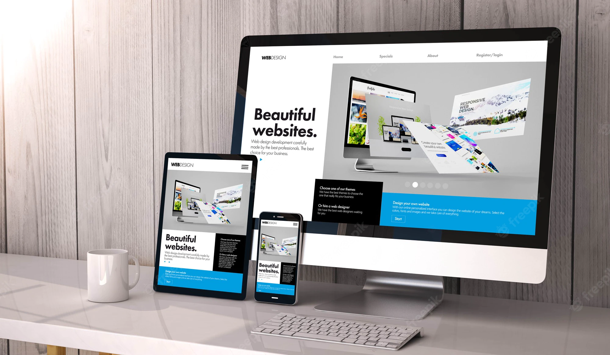
What Is Responsive Web Design?
Responsive web design is a design methodology that uses flexible layouts, scalable images, and CSS media queries to create websites that respond to the user’s device. Whether someone visits a website on a 6-inch smartphone or a 27-inch desktop monitor, the content rearranges itself to remain readable, functional, and visually appealing.
Key elements of responsive web design include:
- Fluid grids that resize proportionally instead of relying on fixed widths
- Flexible images and media that scale within their containers
- CSS media queries that apply different styles based on screen size, resolution, or orientation
The goal is to deliver the same content and core functionality without forcing users to zoom, scroll horizontally, or struggle with navigation.

Why Responsive Web Design Is Important
1. Mobile Traffic Continues to Dominate
More than half of global web traffic now comes from mobile devices. This shift in user behavior means that websites designed only for desktop screens risk alienating a large portion of their audience. Responsive web design ensures that mobile users receive a smooth, optimized experience without compromise.
2. Improved User Experience
User experience is one of the most critical factors in a website’s success. Studies consistently show that users are far less likely to return to a website after a poor experience, especially on mobile devices. Responsive design improves readability, navigation, and interaction, making it easier for users to find information, complete forms, or make purchases regardless of the device they use.
3. Better SEO Performance
Responsive web design plays a major role in search engine optimization (SEO). Search engines prioritize mobile-friendly websites, and Google now uses mobile-first indexing, meaning it primarily evaluates the mobile version of a site when determining rankings.
Having a single responsive website instead of separate desktop and mobile versions also reduces duplicate content issues and makes it easier for search engines to crawl and index pages efficiently.
4. Lower Bounce Rates
Websites that are not optimized for mobile devices often suffer from high bounce rates. When users land on a page that loads slowly, displays poorly, or is difficult to navigate, they are more likely to leave immediately. Responsive web design helps reduce bounce rates by delivering a consistent and accessible experience across all screen sizes.
5. Cost-Effective Development and Maintenance
From a business perspective, responsive web design is more cost-effective than maintaining multiple versions of a website. With a single responsive site, updates, bug fixes, and content changes only need to be applied once. This saves time, reduces development costs, and simplifies long-term maintenance.
6. Faster Page Load Times
Performance is another critical factor. Responsive websites often use optimized images and adaptive loading techniques that improve page speed, particularly on mobile networks. Faster load times lead to better user engagement, improved SEO rankings, and higher conversion rates.
7. Increased Conversion Rates
A responsive website makes it easier for users to take action, whether that means signing up for a newsletter, filling out a contact form, or completing an online purchase. When users can interact comfortably on any device, trust increases, and so do conversion rates.
8. Future-Proof Web Design
New devices and screen sizes continue to emerge every year. Responsive web design provides a future-proof solution by adapting to new resolutions without requiring constant redesigns. This flexibility ensures that websites remain usable and relevant as technology evolves.
.
Conclusion
Responsive web design is no longer just a design trend—it is a fundamental requirement for modern websites. By adapting content to different devices, responsive design improves user experience, supports SEO efforts, reduces costs, and increases engagement and conversions. In a world where users expect fast, accessible, and consistent digital experiences, responsive web design is essential for long-term online success.
Whether you are building a new website or updating an existing one, investing in responsive web design is a strategic decision that benefits users, search engines, and businesses alike.


